How To Color Switch An SVG in Flutter?
A tutorial that demonstrates how to switch colors of an SVG file in Flutter.

As a developer, I enjoy coding in Dart & Flutter.
The Problem
Have you ever thought of color painting an SVG file as a flutter developer? Whoa! Wait, what did I say? I think my tongue got slipped out, or maybe I put too much butter on the bread. Hey, don't overthink; you might get 🧊brain freeze!
✨Don't worry; we'll be covering a detailed solution in this tutorial just for you.
The Solution
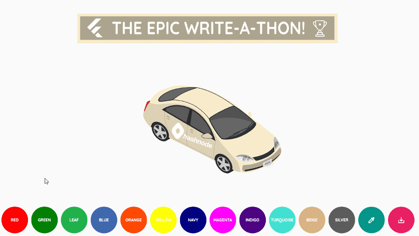
In this tutorial, we will design an app that would:
- Load an SVG file from the assets.
- Allow the user to switch the color using a predefined color palette.
- Enter a custom color using a hex color picker dialog.
- Download the resultant SVG file.
Here's the link1 to the SVG Colorization app.
Thanks to the Hashnode community, we are currently in competition mode2. So, hold on to your seat belts because we are about to ✈️take off!
Tools + Technology = 🧠Creativity
Before moving forward, let's understand how an SVG file is structured. Open up any sample SVG file in your Notepad or VSCode3, and you will observe that almost some path consists of one unique color (e.g., #f7ebcb). In an SVG, the fill property describes the color hex code; see the below snippet.
<path d="M525.9,341.22s-1.2-8.4,0-10.6,3.3-5.4,6-3,5.7,9.3,3,15.7S525.9,341.22,525.9,341.22Z" fill="#f7ebcb" />
Now close the file, drop it in Adobe Illustrator4 and select the color you wish to change.
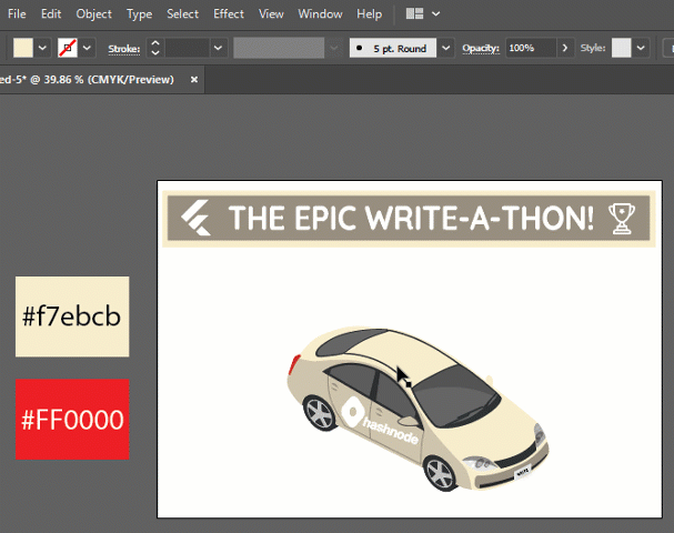
Later, you would observe all the color hex codes would be replaced from #f7ebcb to #FF0000.
<path d="M525.9,341.22s-1.2-8.4,0-10.6,3.3-5.4,6-3,5.7,9.3,3,15.7S525.9,341.22,525.9,341.22Z" fill="#FF0000" />
The Project Structure
Enough theory; let me introduce you to the project structure for this app.
svg_colorization
├─ assets
│  └─ car_front.svg /// The SVG File.
├─ lib
│  ├─ pages
│  │  └─ home.dart
│  ├─ providers
│  │  └─ previous_color.dart /// A [ChangeNotifier] that holds the previous hex color value.
│  │  └─ svg_data.dart /// A [ChangeNotifier] that holds the svg text data.
│  ├─ utils
│  │  └─ util.dart /// A class that handles basic utility functions.
│  ├─ widgets
│  │  └─ circular_button.dart /// A Custom Rounded [Container] widget.
│  │  └─ color_text_field.dart /// A [CupertinoTextField] widget that copies the selected or typed color.
│  │  └─ hex_color_dialog.dart /// A [ColorPicker] widget wrapped in an [AlertDialog].
│  │  └─ scene_renderer.dart /// An [SvgPicture] widget that renders the svg.
│  │  └─ slider_options.dart /// A Custom [Widget] that allows Default & Custom Color Switching with SVG File Saving operations.
│  ├─ main.dart
├─ web
│  ├─ index.html
├─ pubspec.lock
├─ pubspec.yaml
Required Pubspec Packages
You need to define the required packages & asset file path in the pubspec.yaml file.
dependencies:
  flutter:
    sdk: flutter

  # Default icons asset for Cupertino widgets based on Apple styled icons.
  cupertino_icons: ^1.0.2

  # Allows painting and displaying Scalable Vector Graphics 1.1 files.
  flutter_svg: ^1.0.3

  # HSV(HSB)/HSL/RGB/Material color picker.
  flutter_colorpicker: ^1.0.3

  # Include fonts from fonts.google.com.
  google_fonts: ^2.3.2

  # A flutter plugin for bringing hex colors to dart hexcolorPlugin.
  hexcolor: ^2.0.7

  # wrapper around InheritedWidget to make them easier to use and more reusable.
  provider: ^6.0.2

   # To add assets to your application, add an assets section, like this:
  assets:
    - assets/car_front.svg
Coding The Concept
The concept is relatively straightforward; you need to:
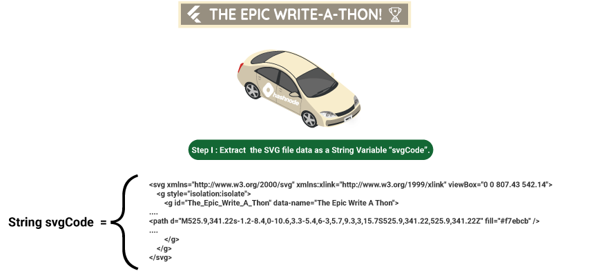
Step 1. Extract the SVG file data as a String variable svgCode; see the below picture.
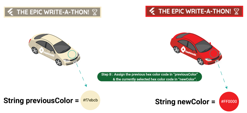
Step 2. Assign the previous hex color code in previousColor & the currently selected hex color code in newColor; see the below illustration.
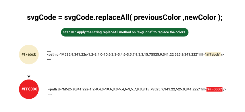
Step 3. Apply the String.replaceAll method on svgCode to replace the colors, refer to the below image.
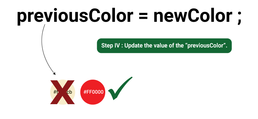
Step 4. Update the value of the previousColor as shown in the below figure.
In terms of dart code, extract all the text from the asset file in the main method and pass the values using a MultiProvider widget.
/// Holds the svg asset text.
String svgCode = '';

void main() async {
  // Do Not Remove This Line.
  WidgetsFlutterBinding.ensureInitialized();

  // Extract The Text From The Asset SVG File.
  svgCode = await rootBundle.loadString("assets/car_front.svg");

  runApp(const SVGColorizationApp());
}

class SVGColorizationApp extends StatelessWidget {
  const SVGColorizationApp({Key? key}) : super(key: key);

  @override
  Widget build(BuildContext context) {
    return MultiProvider(
      providers: [
        ChangeNotifierProvider<SVGData>.value(
          value: SVGData(svgCode),
        ),
        ChangeNotifierProvider<PreviousColor>.value(
            value: PreviousColor('#f7ebcb'))
      ],
      child: MaterialApp(
        title: 'SVG Colorization',
        debugShowCheckedModeBanner: false,
        scrollBehavior: CustomScrollBehavior(),
        theme: ThemeData(
          primarySwatch: Colors.blue,
        ),
        home: const Home(),
      ),
    );
  }
}
As the SVG code & the Previous color value gets updated each time the user selects a color, you'll require two ChangeNotifier classes, as shown in the snippets below.
import 'package:flutter/material.dart';

/// A [ChangeNotifier] that holds the svg text data.
class SVGData with ChangeNotifier {
  /// Holds the `SVG` Formatted Code.
  String code = '';

  SVGData(this.code);

  void updateCode(String previousColor, String newColor) {
    code = code.replaceAll(previousColor, newColor);
    notifyListeners();
  }

  @override
  String toString() => 'SVGData(code:$code)';
}
The updateCode method searches for the previousColor, replaces it with the newColor value, and updates the SVG code.
import 'package:flutter/material.dart';

/// A [ChangeNotifier] that holds the previous hex color value.
class PreviousColor with ChangeNotifier {
  /// Holds the Hex Color Value.
  String value = '';

  PreviousColor(this.value);

  void updateValue(String newValue) {
    value = newValue;
    notifyListeners();
  }

  @override
  String toString() => 'PreviousColor(value:$value)';
}
The updateValue method assigns the current newValue to update the previous color.
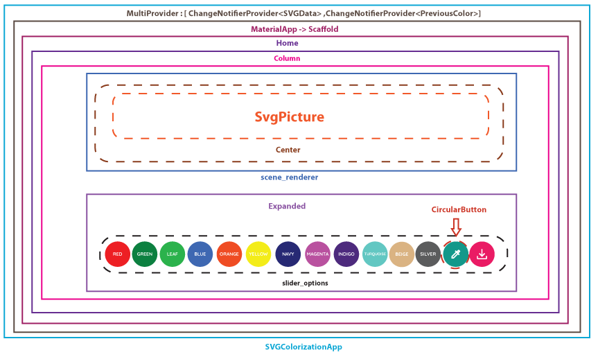
The Widget Breakdown Process
Julius Caesar5 once said,
Divide et impera (Divide and Conquer)
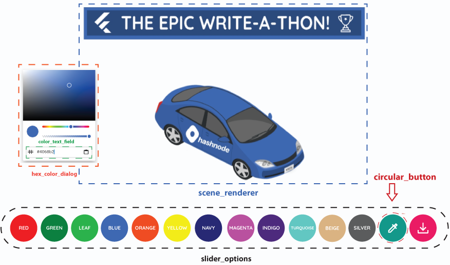
This principle fits perfectly when you're developing an app. Rather than creating a colossal widget tree, refactor the code to make it look cleaner. The below figure illustrates the minimal app widget breakdown.
The Scene Renderer Widget
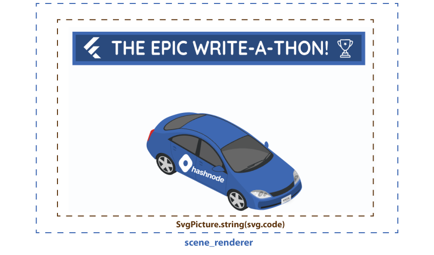
The SvgPicture is a widget imported from the flutter_svg6 package. Assign the updated SVGData.code value using the string constructor. Once the value gets updated, the context.watch would automatically listen to the changes and rebuild the widget tree.
import 'package:flutter/material.dart';
import 'package:flutter_svg/svg.dart';
import 'package:provider/provider.dart';

import 'package:svg_colorization/providers/svg_data.dart';

/// An [SvgPicture] widget that renders the svg.
class SceneRenderer extends StatelessWidget {
  const SceneRenderer({Key? key}) : super(key: key);

  @override
  Widget build(BuildContext context) {
    /// Holds the updated [SVData] object.
    final svg = context.watch<SVGData>();

    return svg.code.isNotEmpty
        ? Center(child: SvgPicture.string(svg.code))
        : const Center(child: CircularProgressIndicator.adaptive());
  }
}
The Circular Buttons Widget
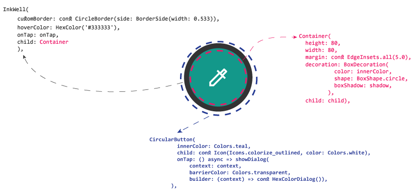
To create rounded-shaped circular buttons, wrap the Container inside an InkWell widget as shown in the below snippet.
import 'package:flutter/material.dart';
import 'package:hexcolor/hexcolor.dart';

/// A Custom Rounded [Container] widget.
class CircularButton extends StatelessWidget {
  final Color innerColor;
  final List<BoxShadow>? shadow;
  final GestureTapCallback? onTap;
  final Widget child;

  const CircularButton({
    Key? key,
    required this.innerColor,
    this.shadow,
    required this.onTap,
    required this.child,
  }) : super(key: key);

  @override
  Widget build(BuildContext context) {
    return InkWell(
      customBorder: const CircleBorder(side: BorderSide(width: 0.533)),
      hoverColor: HexColor('#333333'),
      onTap: onTap,
      child: Container(
        height: 80,
        width: 80,
        margin: const EdgeInsets.all(5.0),
        decoration: BoxDecoration(
          color: innerColor,
          shape: BoxShape.circle,
          boxShadow: shadow,
        ),
        child: child,
      ),
    );
  }
}
The Slider Options Widget
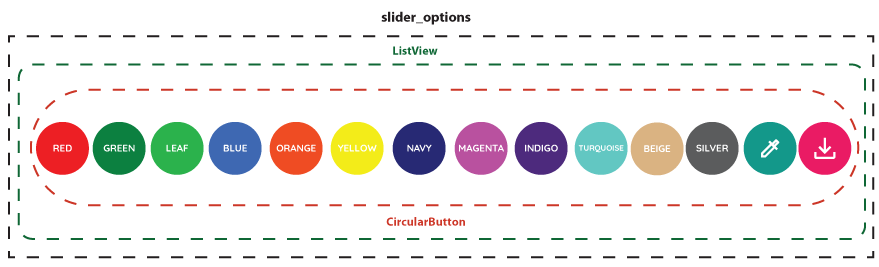
It is a Stateless widget made from the combination of:
Mapped Hex Colored Key-Value Pairs:
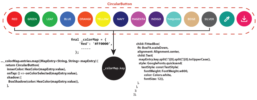
Define a map colorMap with the color name as its key and the hex color as value. Next, you would create a callback function onColorSelected to return the map value once the user taps on it.
import 'package:flutter/material.dart';
import 'package:google_fonts/google_fonts.dart';
import 'package:hexcolor/hexcolor.dart';
import 'package:provider/provider.dart';

import 'package:svg_colorization/providers/svg_data.dart';
import 'package:svg_colorization/utils/util.dart';
import 'package:svg_colorization/widgets/circular_button.dart';
import 'package:svg_colorization/widgets/hex_color_dialog.dart';

/// A Custom [Widget] that allows operations like
/// 1. Default & Custom Color Switching
/// 2. SVG File Saving.
class SliderOptions extends StatelessWidget {

/// Holds the color name with hex value.
  final _colorMap = {
    'Red': '#FF0000',
    'Green': '#008000',
    'Leaf': '#22B14C',
    'Blue': '#4068B2',
    'Orange': '#FF4800',
    'Yellow': '#FFFF00',
    'Navy': '#000080',
    'Magenta:': '#FF00FF',
    'Indigo': '#4B0082',
    'Turquoise': '#40E0D0',
    'Beige': '#D9B382',
    'Silver': '#5B5C5C',
  };

  /// Triggers when tapped on a color.
  final Function(String) onColorSelected;

  SliderOptions({Key? key, required this.onColorSelected}) : super(key: key);

  @override
  Widget build(BuildContext context) {
    return ListView(
      shrinkWrap: true,
      scrollDirection: Axis.horizontal,
      children: [
        /// Loads the Circular Containers With Hex Colors.
        ..._colorMap.entries.map((MapEntry<String, String> mapEntry) {
          return CircularButton(
            innerColor: HexColor(mapEntry.value),
            onTap: () => onColorSelected(mapEntry.value),
            shadow: [
              BoxShadow(color: HexColor(mapEntry.value)),
            ],
            child: FittedBox(
              fit: BoxFit.scaleDown,
              alignment: Alignment.center,
              child: Text(
                mapEntry.key.split(':')[0].split('.')[0].toUpperCase(),
                style: GoogleFonts.quicksand(
                    textStyle: const TextStyle(
                        fontWeight: FontWeight.w800,
                        color: Colors.white,
                        fontSize: 12)),
              ),
            ),
          );
        }),

        /// Pops Up The [HexColorDialog] widget.
        CircularButton(
          innerColor: Colors.teal,
          child: const Icon(Icons.colorize_outlined, color: Colors.white),
          onTap: () async => showDialog(
              context: context,
              barrierColor: Colors.transparent,
              builder: (context) => const HexColorDialog()),
        ),

        /// Saves The Rendered Image to SVG.
        CircularButton(
          innerColor: Colors.pink,
          child: const Icon(Icons.save_alt, color: Colors.white),
          onTap: () async => Util.saveAsSVG(context.read<SVGData>().code),
        ),
      ],
    );
  }
}
The HexColor Dialog Widget
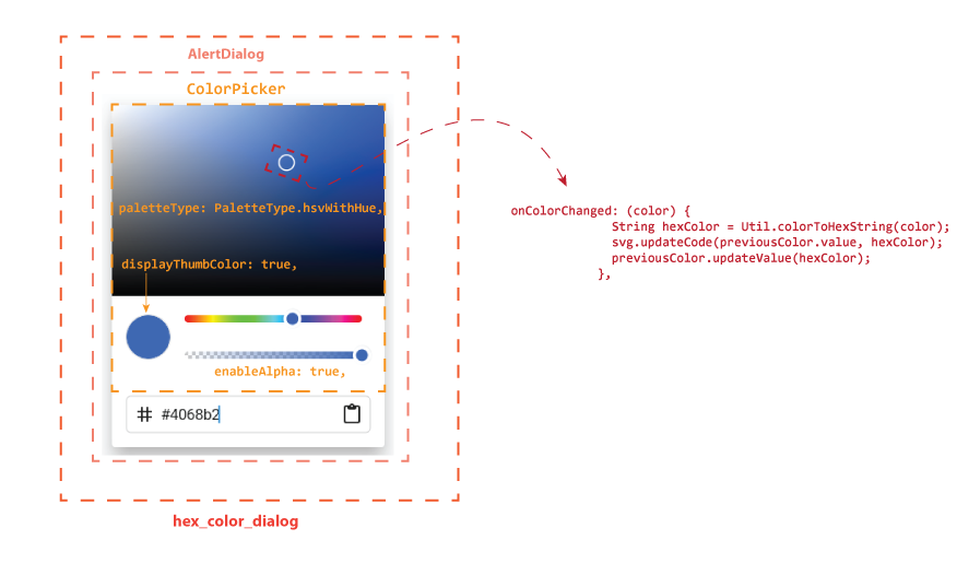
The HexColorDialog is created using the ColorPicker wrapped inside an AlertDialogwidget. To update the rendered SVG, invoke the SVData.updateCode & PreviousColor.updateValue methods respectively under the body of onColorChanged callback.
import 'package:flutter/material.dart';
import 'package:flutter_colorpicker/flutter_colorpicker.dart';
import 'package:hexcolor/hexcolor.dart';
import 'package:provider/provider.dart';

import 'package:svg_colorization/providers/previous_color.dart';
import 'package:svg_colorization/providers/svg_data.dart';
import 'package:svg_colorization/utils/util.dart';
import 'package:svg_colorization/widgets/color_text_field.dart';

/// A [ColorPicker] widget wrapped in an [AlertDialog].
///
/// Returns the selected hex color value.
class HexColorDialog extends StatelessWidget {
  const HexColorDialog({Key? key}) : super(key: key);

  @override
  Widget build(BuildContext context) {

    final svg = context.read<SVGData>();

    final previousColor = context.read<PreviousColor>();

    final textController = TextEditingController(text: previousColor.value);

    return AlertDialog(
      scrollable: true,
      insetPadding: const EdgeInsets.only(right: 800, bottom: 20),
      titlePadding: const EdgeInsets.all(0),
      contentPadding: const EdgeInsets.all(0),
      content: SingleChildScrollView(
        child: Column(
          children: [
            ColorPicker(
              pickerColor: HexColor(previousColor.value),
              onColorChanged: (color) {
                String hexColor = Util.colorToHexString(color);
                svg.updateCode(previousColor.value, hexColor);
                previousColor.updateValue(hexColor);
              },
              colorPickerWidth: 300,
              pickerAreaHeightPercent: 0.7,
              enableAlpha: true,
              displayThumbColor: true,
              paletteType: PaletteType.hsvWithHue,
              labelTypes: const [],
              pickerAreaBorderRadius: const BorderRadius.only(
                topLeft: Radius.circular(2),
                topRight: Radius.circular(2),
              ),
              hexInputController: textController,
              portraitOnly: true,
            ),
            Padding(
              padding: const EdgeInsets.fromLTRB(16, 0, 16, 16),
              child: ColorTextField(colorTextController: textController),
            )
          ],
        ),
      ),
    );
  }
}
The ColorTextField Widget
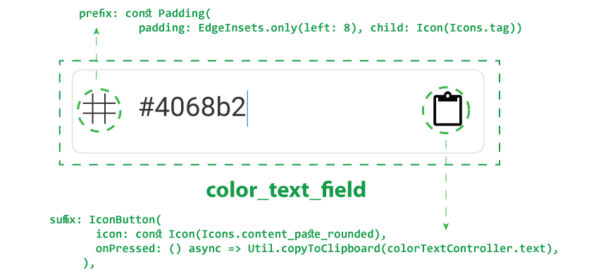
It's a custom CupertinoTextField widget that takes the selected color value using the TextEditingController and copies the color value to the ClipBoard once the user taps on the paste icon, refer to the below snippet.
import 'package:flutter/cupertino.dart';
import 'package:flutter/material.dart';
import 'package:flutter/services.dart';
import 'package:flutter_colorpicker/flutter_colorpicker.dart';

import 'package:svg_colorization/utils/util.dart';

/// A [CupertinoTextField] widget that copies the selected or typed color.
class ColorTextField extends StatelessWidget {
  const ColorTextField({
    Key? key,
    required this.colorTextController,
  }) : super(key: key);

  final TextEditingController colorTextController;

  @override
  Widget build(BuildContext context) {
    return CupertinoTextField(
      controller: colorTextController,
      prefix: const Padding(
          padding: EdgeInsets.only(left: 8), child: Icon(Icons.tag)),
      suffix: IconButton(
        icon: const Icon(Icons.content_paste_rounded),
        onPressed: () async => Util.copyToClipboard(colorTextController.text),
      ),
      autofocus: true,
      maxLength: 9,
      inputFormatters: [
        // Any custom input formatter can be passed
        // here or use any Form validator you want.
        UpperCaseTextFormatter(),
        FilteringTextInputFormatter.allow(RegExp(kValidHexPattern)),
      ],
    );
  }
}
The Util Class
It's best practice to separate the business logic from the UI code. Under the lib folder, create a Util class to handle the essential utility functions as shown in the below snippet.
import 'dart:convert';
// ignore: avoid_web_libraries_in_flutter
import 'dart:html' as html;
import 'dart:ui';

import 'package:flutter/services.dart';

/// A class that handles basic utility functions.
class Util {
  /// Prevents From Object Instantiation.
  Util._();

  /// Formats the given [input] to hex value & copies it to the [Clipboard].
  /// print(copyToClipboard('#f7ebcb')); //F7EBCB

  static Future<void> copyToClipboard(String input) async {
    String textToCopy = input.replaceFirst('#', '').toUpperCase();
    if (textToCopy.startsWith('FF') && textToCopy.length == 8) {
      textToCopy = textToCopy.replaceFirst('FF', '');
    }
    await Clipboard.setData(ClipboardData(text: '#$textToCopy'));
  }

  /// Converts the [Color] object to Hex Formatted String.

  /// const color = Color(0xFFFF00FF);
  /// print(colorToHexString(color)); //'#FF00FF'

  static String colorToHexString(Color color) =>
      '#${color.value.toRadixString(16).substring(2)}';

  /// Works for `Web` only.
  static Future<void> saveAsSVG(String svgCode) async {
    html.AnchorElement()
      ..href =
          '${Uri.dataFromString(svgCode, mimeType: 'image/svg+xml', encoding: utf8)}'
      ..download = 'result.svg'
      ..style.display = 'none'
      ..click();
  }
}
The Final Step
Finally, wrap all the custom widgets under a Column in the Home widget, as shown below.
import 'package:flutter/material.dart';
import 'package:provider/provider.dart';

import 'package:svg_colorization/providers/previous_color.dart';
import 'package:svg_colorization/providers/svg_data.dart';
import 'package:svg_colorization/widgets/scene_renderer.dart';
import 'package:svg_colorization/widgets/slider_options.dart';

class Home extends StatelessWidget {
  const Home({Key? key}) : super(key: key);

  @override
  Widget build(BuildContext context) {
    /// Holds the [SVData] object.
    final svg = context.read<SVGData>();

    /// Holds the [PreviousColor] object.
    final previousColor = context.read<PreviousColor>();

    return Scaffold(
      body: Column(
        children: [
          const SceneRenderer(),
          Expanded(
            child: SliderOptions(
              onColorSelected: (String hexColor) {
                // Replace the svg previous color value with the current [hexColor].
                svg.updateCode(previousColor.value, hexColor);

                // Update the previous color [value].
                previousColor.updateValue(hexColor);
              },
            ),
          ),
        ],
      ),
    );
  }
}
Run the code & 🎉voila, you're done!
Your Contribution Matters🤝🏻
Think you can do better? Go ahead, play around with the code. The source code repo is publicly available on GitHub7.
Acknowledgment
I hope you enjoyed this tutorial; thank you for reading this far. Special thanks to Syed Fazle Rahman for providing me the chance to promote & share knowledge with the audience.
References
[1]: SVG Colorization App
https://svg-colorization.web.app/
[2]: The Epic Hashnode Writeathon
https://townhall.hashnode.com/the-epic-hashnode-writeathon
[3]: Visual Studio Code
https://code.visualstudio.com/download
[4]: Adobe Illustrator
https://www.adobe.com/sea/products/illustrator/free-trial-download.htm
[5]: Divide and Conquer Quote
https://fearlessculture.design/blog-posts/dividing-people-is-the-best-way-to-lead
[6]: Flutter_SVG Package
https://pub.dev/packages/flutter_svg
[7]: SVG Colorization | Zujaj's GitHub
https://github.com/Zujaj/svg_colorization


